One area we discuss a lot with our customers is how to optimise my website for conversion and the value it can deliver for them.
Having a website with lots of traffic is great, but unless your website is optimised to help convert that traffic into leads for your services or sales for your products, all you have left is lots of traffic and a friendly-looking website.
Article Contents
Optimise my website for conversion
Conversion rate optimisation (CRO) is a term which covers the many aspects and techniques that can be introduced to:
- Improve the performance of your website
- Improve visitor engagement
- Convert traffic into customers
In a basic form, A ‘conversion’ is persuading visitors to take the action you require. Examples of this could be completing a contact form, scheduling an appointment, purchasing a product, downloading a whitepaper, or registering for your newsletter.
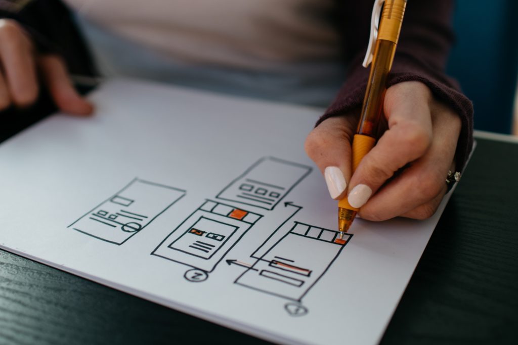
One of the best ways to improve conversion rates on a website is the design. We talk lots about conversion rate optimisation and its importance for small business, startups, and global brands. So here are we some of the best ways of optimising your website for better conversions.
The design.
Having a great looking website is one thing, but ensuring that the design considers your ideal customer avatar (ICA) and how they receive content is another. Research has shown that website visitors view your website, in the same way, that view and read a book, from top left to bottom right. What does this mean for your website? You need to ensure that your key messaging and content is in a place that is more likely to be viewed first or for a prolonged period.
An area we see too often is overly complicated design and structure—form over function. Some of the best-designed websites are very simple. An example often used within design conversations is Google’s homepage. The core function of Google is to search. So the design of this page utilises negative space, drawing the visitors eye to the search bar, ensuring they take action as required.

Whilst a video can explain what you do in a few short minutes; it is not always the best thing to have loading at the top of a page. I’ve seen first hand the impact auto-play videos with audio can have on bounce rates, let alone conversion.
Many other aspects should be considered when designing and developing a website for conversion, including the use of colour and how it can impact different demographics and various image types.

Source: Signal v. Noise
The user experience commonly referred to as UX.
You want your websites visitors to have a positive experience when browsing the content on your website. This is where good UX plays its role. As mentioned in the above point, it really is vital to understand your ICA when designing and building a website.
Knowing your ICA ensures that you can design your website and its content to be useful and valuable to them. This, of course, dramatically increases conversion potential for this audience.
Trust is also part of the UX and a big factor when looking to optimise my website for conversion. So adding factors that build and strengthen trust in your business is a key part of improving the conversion. These could be as simple as:
- Governing bodies and associations you are aligned with.
- Case studies and testimonials from your clients.
- Adding payment security to your eCommerce site is a must, highlighting with logos if possible.
Giving your visitors a reason to trust your website from the very second they click on and begin to scroll is a great conversion driver.

Other factors with the UX of your website that impact conversion rate are the ease of use and call to actions (CTAs).
Is your navigation clear and accessible on all devices easily? Many businesses tend to use a template or theme when first building their website and use the often fancy pop out and overly complicated navigation which sadly, is likely to impact your conversion and customers journey through your website.
Adding functionality to your eCommerce website that allows visitors to order and pay as guests can improve checkout conversion by up to 65%.
The speed your page loads.
We live in a digital world were internet users want information instantly. So, it is vital that your website loads quickly; in fact, slow page load speed also negatively impacts your rankings on Google. So if you have invested in SEO, this will be a significant factor. It would help if you improved it with quality hosting, set up and development. You wouldn’t build a house without a stable, reliable foundation, and you shouldn’t be building your website without stable, dedicated hosting. Website hosting shouldn’t be an afterthought in the process, it should be a key consideration from the very beginning.
More often than not, some tweaks to the image format and size can make a huge difference, but you may also need to look at how the code loads, caching, and minify larger files and scripts.
As tempting as it is to jump straight into adding plugins to help fix and resolve some of these issues, this can often slow your website down further. Any good website design and development agency can help here, and the value that can be added to your website and its conversation rate is huge.
How many times have you got lost looking for information on a website, given up and headed back to Google for another search?
Think of the navigation and user journey on your website as one aspect. The main navigation at the top or side of the page should be as clean and as straightforward as possible. Accessible from both desktop and mobile devices with ease. The navigation built into your content should follow suit with a defined call to action (CTA) as visual aids throughout your website.
A CTA doesn’t need to be a link to a form or contact page. It should be an action which adds the most value to your visitor at that moment of their journey. This could be a link to another content page on your website or to download a whitepaper.
You should design the user journey to guide your initial website traffic from visitor to conversion. It’s essential to consider the journey you want them to take as a whole. A user journey that jumps straight from landing page to checkout is not useful. Give your visitors a reason to stay on your website with engaging content.

Depending on your business’s nature, adding additional functionality to your website can be a massive boost to helping them move on their journey. One of the best solutions for this and improving interaction is live chat and chatbots. According to CrazyEgg 38% of consumers, are more likely to buy from a company if they offer live chat support.
Adding to this, a study by AMA also found that live chat can be used effectively throughout the user journey, highlighting an improvement in:
- Marketing awareness (+29%)
- Early-stage sales development (+32%)
- Post-sales customer support (+39%)
Over-optimised for conversions.
The key to remember with the information above is not to turn your site into a robotic website over-optimised for conversions.
A good website design and development agency will point you in the right direction and guide you through the best possible solution for your business. What works for one audience more than likely won’t work for another, so it’s essential to test and tweak. In my opinion, a website is never really complete!
I hope you can use the above as a reference and if you have questions about how to optimise your website for conversion, I would love to discuss these with you.


